Start Using X-Axis Scroll in 3 Steps
Step 1: Add a Supported Block
X-Axis Scroll works with two core WordPress blocks:
- Group Block (Row Layout) – Set horizontal layout with Wrap disabled
- Columns Block – Any columns layout
Step 2: Find X-Axis Scroll Settings
Select your Group or Columns block, then look in the right sidebar for “X-Axis Scroll Settings” panel.
Step 3: Enable Horizontal Scrolling
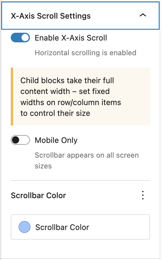
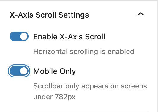
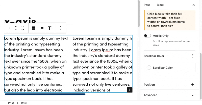
Toggle “Enable X-Axis Scroll” to add horizontal scrolling when content exceeds the container width.
Advanced Settings
Mobile Only Option
Toggle “Mobile Only” to restrict horizontal scrolling to mobile devices (screens under 782px wide):
- Mobile Only ON – Scrolling appears only on mobile devices
- Mobile Only OFF – Scrolling appears on all screen sizes (default)
Breakpoint Details
The extension uses WordPress’s standard responsive breakpoint:
- Mobile – Screens 781px or less
- Desktop – Screens 782px or more
Custom Scrollbar Color
Customize the scrollbar appearance using the Scrollbar Color picker:
- Click the color circle to open the color picker
- Choose from preset colors or select a custom color
- The color applies to the scrollbar thumb (the draggable part)
Color Fallback Behavior
If no custom color is set, the scrollbar uses this priority order:
- 1. Custom color (if selected)
- 2. Theme’s primary color preset
- 3. Default gray color (#666)
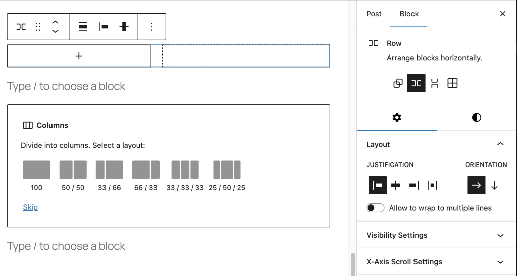
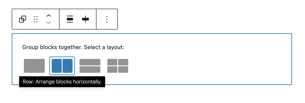
Layout Requirements
For Group blocks, the X-Axis Scroll panel only appears when:
- Layout Type – Set to “Row” (not “Stack”)
- Flex Wrap – Set to “No wrap” (creates row layout)
- Orientation – Not set to “Vertical” (default is horizontal)
How to Configure Group Block Layout
- Select the Group block
- Choose row layout
- The X-Axis Scroll panel will now appear in the sidebar
Browser Compatibility
The custom scrollbar color works on all modern browsers:
- Chrome/Edge/Opera – Fully supported
- Firefox – Fully supported
- Safari – Supported (Safari 26.2+, released December 2025)
Fallback: On older browsers, scrolling still works perfectly – just uses the browser’s default scrollbar colors.
Examples
Mobile-Only Image Gallery
1. Add Group block → Set layout to Flex with "No wrap"
2. Add multiple Image blocks side by side
3. Enable X-Axis Scroll
4. Toggle "Mobile Only" ON
5. Result: Images stack on desktop, scroll horizontally on mobile
Wide Data Table
1. Add Columns block
2. Insert a Table block with many columns
3. Enable X-Axis Scroll
4. Keep "Mobile Only" OFF (scroll on all devices)
5. Custom color: Match your brand color
Tips & Best Practices
- Content Width – Set fixed widths on child items for consistent scrolling behavior
- Visual Affordance – Ensure some content is partially visible to indicate scrolling is possible
- Scrollbar Color – Match your theme’s primary color for consistent branding
- Accessibility – Horizontal scrolling preserves access to all content without hiding it
Key Points to Remember
- Group Block – Must use Row layout with “No wrap” setting
- Columns Block – Works with all column layouts
- Prevents Shrinking – Child blocks won’t shrink below their natural size
- Breakpoint – 782px (matches WordPress admin bar breakpoint)
- No JavaScript – Pure CSS solution for optimal performance
Quick Troubleshooting
Can’t see X-Axis Scroll Settings?
→ For Group blocks: Check that layout is set to “Row” with “No wrap”
→ Make sure the block is selected and sidebar is open
Scrollbar not appearing?
→ Content must exceed the container width for scrollbar to show
→ Try reducing container width or adding more content
Children shrinking too much?
→ The extension automatically prevents flex children from shrinking
→ Set explicit widths on child blocks if needed
Mobile only not working?
→ Check your screen size – breakpoint is 782px
→ Preview at mobile width (under 782px) to see the scrollbar
Scrollbar color not changing?
→ Clear browser cache after publishing changes
→ Check that the color value was saved in block attributes
Leave a Reply