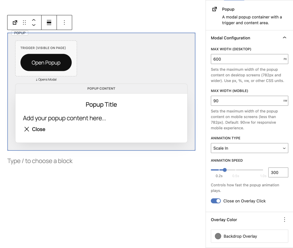
Category: Uncategorized

  • Cover block extensions

    Mobile Cover

    Add a Cover Block

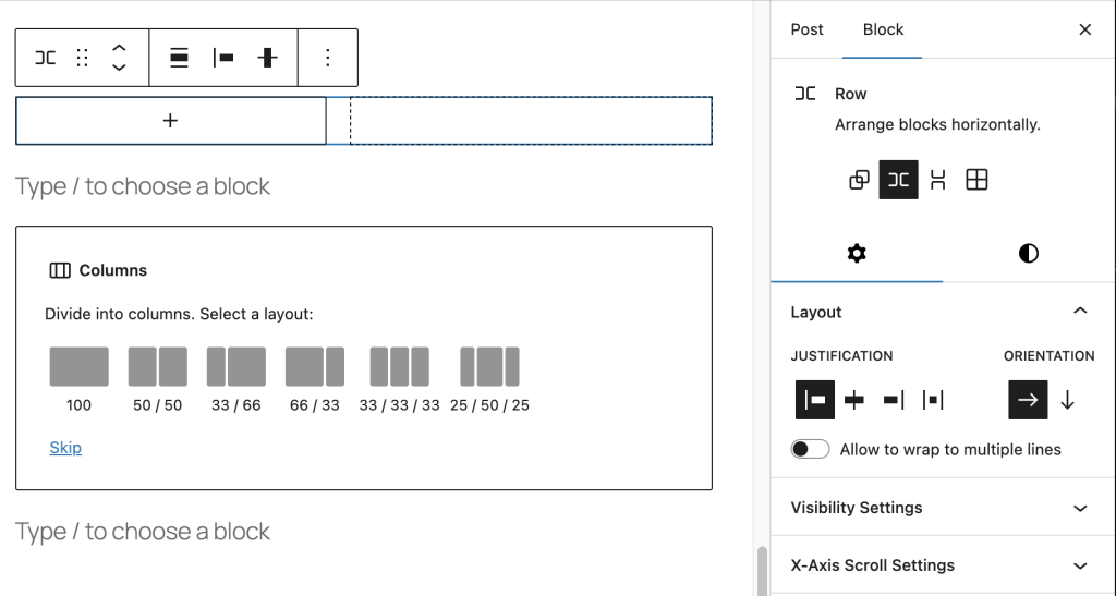
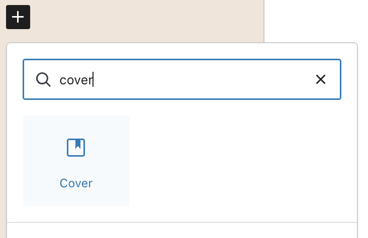
    Search for “Cover” in the block inserter and add it to your page.

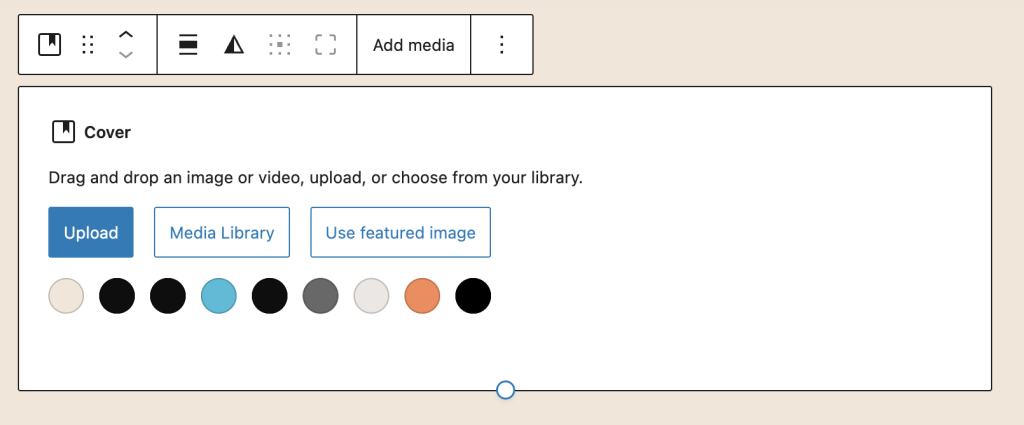
    Set Desktop Background Image

    Important: You must set a desktop background image first. The mobile image works as an alternative to the desktop image, not a replacement.

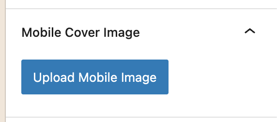
    Upload Mobile Cover Image

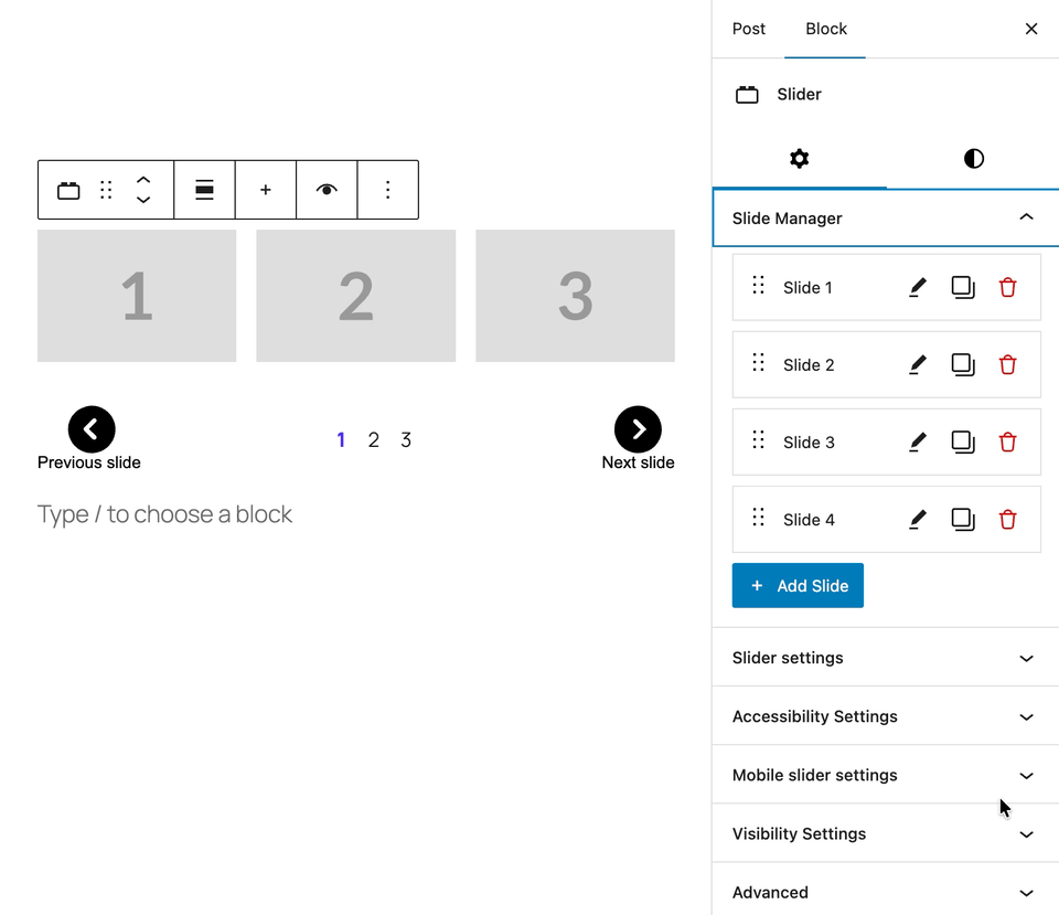
    With the Cover block selected, find the “Mobile Cover Image” panel in the right sidebar:

    • Click “Upload” or “Select from Media Library”
    • Choose your mobile-optimized image
    • The image will display on screens 781px or narrower

    Adjust Mobile Settings

    Once your mobile image is uploaded, additional controls appear in the Mobile Cover Image panel:

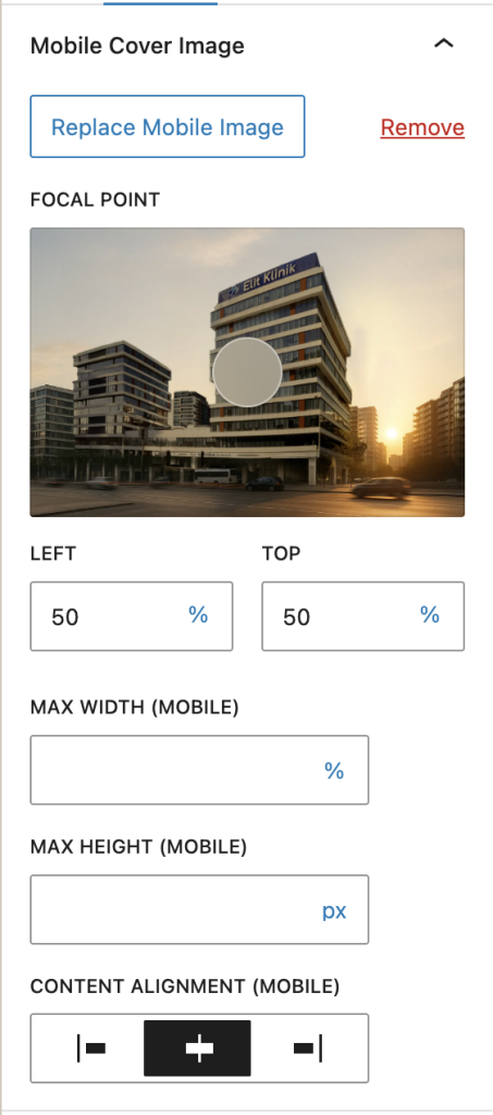
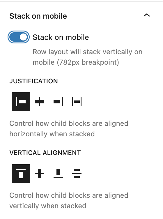
    Mobile Settings Explained

    Mobile Focal Point

    Control which part of your mobile image stays visible when the cover is resized:

    • Click anywhere on the image preview
    • Drag the focal point to adjust positioning
    • Independent from desktop focal point (can be different)

    Focal Point Best Practices

    Portraits: Focus on the face (upper center)
    Text overlays: Focus on the area where text appears
    Landscapes: Center the focal point (default 50% 50%)

    Mobile Width

    Control the maximum width of the cover block on mobile devices:

    • Leave empty for 100% width (default)
    • Enter a value like “400px” for a fixed width
    • Use percentages like “90%” for relative width

    Mobile Height

    Set the height of the cover block on mobile devices:

    • Leave empty to use image’s height
    • Enter “300px” for a fixed height
    • Use viewport units like “50vh” (50% of viewport height)

    Image Alignment (Horizontal)

    Control how content inside the cover aligns horizontally on mobile:

    • Left – Align image to the left edge
    • Center – Align image to center (default)
    • Right – Align image to the right edge

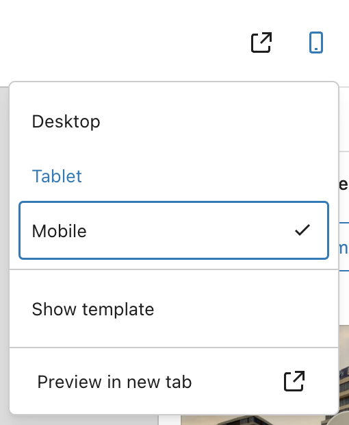
    Previewing Mobile Changes

    See your mobile image and settings in real-time while editing:

    • Click the Cover block to select it
    • Click the Mobile icon in the WordPress editor toolbar (top-right)
    • The preview switches to mobile image automatically
    • Adjust settings and see changes instantly

    Mobile Breakpoint

    The extension uses WordPress’s standard responsive breakpoint:

    • Mobile – Screens 781px or less (mobile image displays)
    • Desktop – Screens 782px or more (desktop image displays)

    This matches the WordPress admin bar breakpoint for consistency.

    Examples

    Hero Section with Portrait & Landscape

    1. Add Cover block → Upload landscape desktop image (1920x600px)
    2. Upload vertical mobile image (800x1200px)
    3. Desktop focal point: Center (50% 50%)
    4. Mobile focal point: Upper center (subject's face)
    5. Result: Optimized images for both orientations

    Short Mobile Cover with Full-Width Desktop

    1. Desktop image: Full-width banner (100vh height)
    2. Mobile image: Compact banner (400px height)
    3. Set Mobile Height: "400px"
    4. Set Content Alignment: "Center"
    5. Result: Tall desktop cover, compact mobile cover

    Centered Content on Mobile

    1. Desktop: Cover with left-aligned content
    2. Upload mobile image
    3. Set Mobile Width: "90%" (some margins on sides)
    4. Set Content Alignment: "Center"
    5. Result: Centered content layout on mobile only

    Tips & Best Practices

    • Image orientation – Use portrait/vertical images for mobile, landscape for desktop
    • Focal points – Set different focal points for desktop vs mobile based on composition
    • Height control – Use viewport units (vh) for proportional mobile heights
    • Always set desktop image first – Mobile image is an alternative, not a replacement

    Quick Troubleshooting

    Mobile image not showing on frontend?
    → Make sure you have a desktop background image set
    → Check that the mobile image URL is saved in block attributes

    Can’t see Mobile Cover Image panel?
    → Make sure a Cover block is selected
    → The panel appears in the right sidebar (Inspector Controls)

    Wrong image showing on mobile?
    → Check your screen size – breakpoint is ≤781px
    → Preview at mobile width (≤781px) to see the mobile image

    Focal point not working?
    → The mobile focal point only applies on mobile viewports (≤781px)
    → Switch to mobile preview to see mobile focal point in action
    → Desktop view uses the desktop focal point

    Mobile height not applying?
    → Check that a value is entered (e.g., “400px” or “50vh”)
    → Mobile height only applies at the 781px breakpoint
    → Leave empty to use desktop height settings


  • Popup

    Step 1: Add the Popup Block

    Search for “Popup” in the block inserter and click to add it to your page.

    Step 2: Customize Your Trigger

    The trigger is what visitors click to open the popup. You can use any WordPress blocks:

    • Button (default) – Click to edit text and style
    • Image – Great for promotional banners
    • Text/Heading – Simple text links
    • Any block – Icons, columns, groups, etc.

    Step 3: Add Content to the Popup

    Click on the Popup Content area to add any blocks you want:

    • Headings and text
    • Images and videos
    • Contact forms
    • Buttons and links
    • Any WordPress block

    Step 4: Customize Close Button

    Click on the close button to customize it in the sidebar:

    • Position – Top right, top left, or custom placement
    • Icon Style – Choose from X, circle-x, or upload custom icon
    • Size & Colors – Adjust icon size and colors
    • Button Text – Optionally show “Close” text

    Step 5: Configure Popup Settings

    With the main Popup block selected, adjust settings in the Inspector Controls (right sidebar):

    • Width – Desktop popup width (default: 600px)
    • Mobile Width – Mobile popup width (default: 90vw)
    • Animation Type – Scale, fade, slide-up, or slide-down
    • Animation Speed – How fast it opens (default: 0.3s)
    • Overlay Color – Background color behind popup

    Advanced Settings

    Animation Types

    Choose how your popup appears:

    • Scale – Popup grows from center (default)
    • Fade – Smooth fade-in effect
    • Slide Up – Slides from bottom to center
    • Slide Down – Slides from top to center

    Responsive Width Settings

    Control popup size on different devices:

    • Desktop Width – Set fixed size (e.g., 600px) or percentage (e.g., 80%)
    • Mobile Width – Recommended: 90vw for mobile devices

    Overlay Click Behavior

    Control what happens when users click outside the popup:

    • Close on Overlay Click (ON) – Clicking backdrop closes popup (default)
    • Close on Overlay Click (OFF) – Only close button or ESC key closes popup

    Close Button Positioning

    The close button can be positioned in multiple ways:

    • Absolute Positioning – Top-right, top-left, bottom-right, bottom-left
    • Offset Controls – Fine-tune position with top/right/bottom/left values
    • Normal (in flow) – Move the close button block anywhere within popup content using block toolbar arrows or list view

    Custom Close Icons

    Upload your own close button icon:

    • Select the close button
    • In sidebar, change Icon Type to “Custom”
    • Click Select Icon to upload or choose from media library
    • Adjust icon size as needed

    Styling with Block Supports

    All popup components support WordPress styling controls:

    • Popup Content – Background, text colors, padding, border, border-radius
    • Trigger – Text/background colors, padding, margin
    • Close Button – Font size, colors, padding, margin, border, border-radius, shadow


    Example Setups

    Newsletter Signup

    1. Add Popup block
    2. Trigger: Button with "Subscribe to Newsletter"
    3. Content: Heading + Paragraph + Form
    4. Width: 500px, Animation: Scale
    5. Close button: Top-right with circle-x icon

    Promotional Offer

    1. Add Popup block
    2. Trigger: Image banner or text link
    3. Content: Large heading + Discount code + CTA button
    4. Width: 700px, Animation: Slide-up
    5. Disable "Close on Overlay Click" for important offers

    Video Player

    1. Add Popup block
    2. Trigger: Image thumbnail with play icon overlay
    3. Content: Embed or Video block
    4. Width: 90%, Mobile: 95vw
    5. Animation: Fade, Close button: Minimal styling

    Image Gallery Lightbox

    1. Add Popup block
    2. Trigger: Thumbnail image
    3. Content: Full-size image + caption
    4. Width: 80%, Animation: Scale
    5. Close on overlay click: ON for quick browsing

    Terms & Conditions

    1. Add Popup block
    2. Trigger: "Read Terms" text link
    3. Content: Heading + long-form paragraph blocks
    4. Width: 800px, Mobile: 95vw
    5. Add padding to content for better readability

    Accessibility Features

    The popup block is built with WCAG 2.1 AA compliance:

    • Keyboard Navigation – Open with Enter/Space, close with ESC key
    • Focus Management – Automatic focus trap inside popup, returns focus to trigger on close
    • ARIA Attributes – Proper aria-label and aria-haspopup for screen readers
    • Native Dialog – Uses HTML5 <dialog> element for built-in accessibility

    Tips & Best Practices

    • Keep it concise – Popups work best with focused content
    • Clear trigger text – Make it obvious what clicking will do
    • Accessibility labels – Always provide descriptive aria-labels for triggers and close buttons
    • Use overlay click wisely – Disable for critical information, enable for quick-view content

    Quick Troubleshooting

    Popup not opening?
    → Make sure you have both Popup Trigger and Popup Content blocks inside the main Popup block

    Close button not visible?
    → Check that the close button block hasn’t been accidentally deleted – you can re-add it from the block inserter

    Popup too wide on mobile?
    → Use viewport units (90vw) instead of fixed pixels for mobile width

    Can’t click outside to close?
    → Check the “Close on Overlay Click” setting in the sidebar – toggle it ON

    Animation looks choppy?
    → Try a faster animation speed (0.2s) or switch to “Fade” animation type


  • Mobile Stack layout for row/column blocks

    Add a Supported Block

    Mobile Stack works with two core WordPress blocks:

    • Group Block (Row Layout) – Set horizontal layout with Wrap disabled
    • Columns Block – Any columns layout (stacking enabled by default)

    Enable Vertical Stacking

    For Group blocks: Toggle “Stack on mobile” to enable vertical stacking on mobile devices.

    For Columns blocks: Stacking is enabled by default – just configure alignment settings.

    Advanced Settings

    Justification Control

    Control how child blocks are aligned horizontally when stacked on mobile:

    • Start – Align to left (default)
    • Center – Align to center
    • End – Align to right
    • Stretch – Stretch to fill container width

    Vertical Alignment Control

    Control how child blocks are aligned vertically when stacked on mobile:

    • Top – Align to top (default)
    • Center – Align to center vertically
    • Bottom – Align to bottom
    • Space Between – Distribute space evenly between items

    Understanding Vertical Alignment

    This controls vertical positioning within the container. Use “Space Between” to add spacing between stacked items or “Center” to center them vertically in the viewport.

    Mobile Breakpoint

    The extension uses WordPress’s standard responsive breakpoint:

    • Mobile – Screens 781px or less (stacking applies)
    • Desktop – Screens 782px or more (row layout preserved)

    Examples

    E-commerce Product Cards

    1. Add Group block → Set layout to Row with "No wrap" 2. Add 3 Product Card blocks side by side 
    3. Enable Mobile Stack 
    4. Set Justification to "Center" for centered cards on mobile 
    5. Set Vertical Alignment to "Space Between" for even spacing 
    6. Result: 3-column row on desktop, stacked cards on mobile

    Team Member Profiles

    1. Add Columns block (2 columns) 
    2. Insert team member profile in each column 
    3. Keep default stacking (enabled for Columns) 
    4. Set Justification to "Stretch" for full-width profiles on mobile 
    5. Result: Side-by-side on desktop, stacked full-width on mobile

    Feature Cards with Images

    1. Add Group block → Row layout with "No wrap" 
    2. Add 4 Feature Card blocks (icon + text) 
    3. Enable Mobile Stack 
    4. Set Justification to "Start" for left alignment 
    5. Set Vertical Alignment to "Top" 
    6. Result: 4-column feature row on desktop, vertical stack on mobile

    Tips & Best Practices

    • Content Width – Child blocks automatically stretch to 100% width on mobile
    • Alignment Choice – Use “Center” justification for centered content like cards or images
    • Vertical Spacing – Use “Space Between” to evenly distribute stacked items vertically
    • Mutual Exclusion – Mobile Stack automatically disables X-Axis Scroll (they can’t work together)
    • Preview Responsively – Use browser responsive mode at 781px to see stacking behavior

    Key Points to Remember

    • Group Block – Must use Row layout with “No wrap” setting
    • Columns Block – Stacking enabled by default, just configure alignment
    • Breakpoint – 782px (matches WordPress admin bar breakpoint)
    • Child Width – All children stretch to 100% width when stacked

    Quick Troubleshooting

    Can’t see Mobile Stack Settings?
    → For Group blocks: Check that layout is set to “Row” with “No wrap”
    → Make sure the block is selected and sidebar is open
    → For Columns: Settings always visible (stacking is default)

    Stacking not working on mobile?
    → Check your screen size – breakpoint is 782px
    → Preview at mobile width (under 782px) to see stacking
    → For Group blocks: Ensure “Stack on mobile” toggle is ON

    X-Axis Scroll disappeared?
    → This is expected behavior – Mobile Stack and X-Axis Scroll are mutually exclusive
    → Enabling one automatically disables the other
    → Choose the mobile behavior that fits your use case

    Children not full width on mobile?
    → Mobile Stack automatically sets flex-basis to 100% for children
    → Check for custom CSS that might override this behavior
    → Verify child block widths are set to “default” or “fill”


  • X-Axis Scroll

    Start Using X-Axis Scroll in 3 Steps

    Step 1: Add a Supported Block

    X-Axis Scroll works with two core WordPress blocks:

    • Group Block (Row Layout) – Set horizontal layout with Wrap disabled
    • Columns Block – Any columns layout

    Step 2: Find X-Axis Scroll Settings

    Select your Group or Columns block, then look in the right sidebar for “X-Axis Scroll Settings” panel.

    Step 3: Enable Horizontal Scrolling

    Toggle “Enable X-Axis Scroll” to add horizontal scrolling when content exceeds the container width.

    Advanced Settings

    Mobile Only Option

    Toggle “Mobile Only” to restrict horizontal scrolling to mobile devices (screens under 782px wide):

    • Mobile Only ON – Scrolling appears only on mobile devices
    • Mobile Only OFF – Scrolling appears on all screen sizes (default)

    Breakpoint Details

    The extension uses WordPress’s standard responsive breakpoint:

    • Mobile – Screens 781px or less
    • Desktop – Screens 782px or more

    Custom Scrollbar Color

    Customize the scrollbar appearance using the Scrollbar Color picker:

    • Click the color circle to open the color picker
    • Choose from preset colors or select a custom color
    • The color applies to the scrollbar thumb (the draggable part)

    Color Fallback Behavior

    If no custom color is set, the scrollbar uses this priority order:

    • 1. Custom color (if selected)
    • 2. Theme’s primary color preset
    • 3. Default gray color (#666)

    Layout Requirements

    For Group blocks, the X-Axis Scroll panel only appears when:

    • Layout Type – Set to “Row” (not “Stack”)
    • Flex Wrap – Set to “No wrap” (creates row layout)
    • Orientation – Not set to “Vertical” (default is horizontal)

    How to Configure Group Block Layout

    • Select the Group block
    • Choose row layout
    • The X-Axis Scroll panel will now appear in the sidebar

    Browser Compatibility

    The custom scrollbar color works on all modern browsers:

    • Chrome/Edge/Opera – Fully supported
    • Firefox – Fully supported
    • Safari – Supported (Safari 26.2+, released December 2025)

    Fallback: On older browsers, scrolling still works perfectly – just uses the browser’s default scrollbar colors.

    Examples

    Mobile-Only Image Gallery

    1. Add Group block → Set layout to Flex with "No wrap"
    2. Add multiple Image blocks side by side
    3. Enable X-Axis Scroll
    4. Toggle "Mobile Only" ON
    5. Result: Images stack on desktop, scroll horizontally on mobile

    Wide Data Table

    1. Add Columns block
    2. Insert a Table block with many columns
    3. Enable X-Axis Scroll
    4. Keep "Mobile Only" OFF (scroll on all devices)
    5. Custom color: Match your brand color

    Tips & Best Practices

    • Content Width – Set fixed widths on child items for consistent scrolling behavior
    • Visual Affordance – Ensure some content is partially visible to indicate scrolling is possible
    • Scrollbar Color – Match your theme’s primary color for consistent branding
    • Accessibility – Horizontal scrolling preserves access to all content without hiding it

    Key Points to Remember

    • Group Block – Must use Row layout with “No wrap” setting
    • Columns Block – Works with all column layouts
    • Prevents Shrinking – Child blocks won’t shrink below their natural size
    • Breakpoint – 782px (matches WordPress admin bar breakpoint)
    • No JavaScript – Pure CSS solution for optimal performance

    Quick Troubleshooting

    Can’t see X-Axis Scroll Settings?
    → For Group blocks: Check that layout is set to “Row” with “No wrap”
    → Make sure the block is selected and sidebar is open

    Scrollbar not appearing?
    → Content must exceed the container width for scrollbar to show
    → Try reducing container width or adding more content

    Children shrinking too much?
    → The extension automatically prevents flex children from shrinking
    → Set explicit widths on child blocks if needed

    Mobile only not working?
    → Check your screen size – breakpoint is 782px
    → Preview at mobile width (under 782px) to see the scrollbar

    Scrollbar color not changing?
    → Clear browser cache after publishing changes
    → Check that the color value was saved in block attributes


  • Slider

    Step 1: Add the Slider Block

    Search for “Slider” in the block inserter and click to add it to your page.

    Step 2: Add Your Content

    Each slide can contain any WordPress blocks – images, text, buttons.

    • Click on a slide to edit its content
    • Use the + Add block button inside slides
    • Drag and drop content blocks into slides

    Step 3: Configure Your Slider

    With the slider selected, open the Inspector Controls (right sidebar) to adjust settings:

    • Slides Per View – How many slides show at once
    • Slide Gap – Space between slides
    • Navigation – Show/hide arrow buttons
    • Pagination – Show/hide dot indicators

    Step 4: Manage Your Slides

    Use the Slide Manager in the sidebar to organize your slides:

    • Add New Slide – Click the blue button to add slides
    • Rename Slides – Click the name to edit it
    • Reorder – Drag slides to change their order
    • Duplicate – Copy slides with their content
    • Delete – Remove slides you don’t need

    Advanced Settings

    Zoom Mode – Bird’s Eye View

    Toggle Zoom Mode in the block toolbar to see all slides at once!

    • Overview – See all slides in one view
    • Reorder – Drag slides to rearrange them
    • Auto-zoom – Optional auto-centering on selected slides

    Style Variations

    Choose different styles from the block toolbar:

    Default – Classic carousel slider

    Highlight Middle – Center slide stands out with coverflow effect

    Highlight Group – Center group of slides highlighted

    Desktop/Mobile Settings

    Configure different behaviors for different devices:

    • Slides Per View (Desktop) – Default: 3 slides
    • Slides Per View (Mobile) – Default: 1 slide
    • Direction – Horizontal or vertical scrolling
    • Scrollbar – Enable for mobile/desktop separately

    Autoplay & Loop

    Make your slider automatic:

    • Enable Autoplay – Slides advance automatically
    • Autoplay Delay – Time between slides (default: 3 seconds)
    • Enable Loop – Continuous cycling through slides
    • Slides Per Group – How many slides advance at once

    Pagination Settings

    If you have Pagination enabled (dot indicators below the slider), use the Color and Typography panels to adjust their visual style:

    Color Settings
    • Text – Sets the color of the slide numbers inside the pagination dots.
    • Active Text Color – Sets the text color for the dot corresponding to the currently visible slide (e.g., the ‘1’ in the purple dot).
    • Active Background Color – Sets the background color of the dot corresponding to the currently visible slide (e.g., the purple dot).
    • Inactive Background Color – Sets the background color for all other (non-active) pagination dots (e.g., dots ‘2’ and ‘3’).
    Typography Settings
    • SIZE – Change the size of the pagination dots, with options ranging from S (Small) to XXL (Extra Extra Large). The default size is L (Large).


    Example Setups

    Image Gallery

    1. Add Slider block
    2. Set Slides Per View: 3 (Desktop), 1 (Mobile)
    3. Enable Navigation and Pagination
    4. Add Image blocks to each slide
    5. Enable Loop for continuous browsing

    Testimonials Carousel

    1. Add Slider block
    2. Choose "Highlight Middle" style
    3. Set Slides Per View: 3
    4. Add Quote + Paragraph blocks to each slide
    5. Include customer name and photo in each slide

    Product Features

    1. Add Slider block
    2. Enable Autoplay with 5 second delay
    3. Set Slides Per View: 1
    4. Add Heading + Image + Button to each slide
    5. Disable Navigation for cleaner look

    Team Members Grid

    1. Add Slider block
    2. Choose "Highlight Group" style
    3. Set Slides Per View: 4 (Desktop), 1 (Mobile)
    4. Add Image + Heading + Paragraph for each team member
    5. Enable Pagination dots

    Navigation Controls

    The slider includes automatic navigation controls that you can customize:

    • Previous/Next Arrows – Click or use keyboard arrows
    • Pagination Dots – Jump directly to any slide
    • Touch/Swipe Support – Mobile-friendly gestures
    • Keyboard Navigation – Arrow keys for accessibility

    Tips & Best Practices

    • Consistent Content – Keep slide heights similar for smooth transitions
    • Optimize Images – Use properly sized images for faster loading
    • Use Zoom Mode – Perfect for managing slides with lots of content
    • Accessibility – Add descriptive label to slider and alt text to images in slides

    Quick Troubleshooting

    Slides not showing correctly?
    → Check your “Slides Per View” setting in the sidebar

    Can’t add more slides?
    → Use the “Add New Slide” button in the Slide Manager panel

    Content overlapping?
    → Increase the “Slide Gap” setting or use consistent image sizes

    Zoom mode not working?
    → Click the Zoom Mode button in the block toolbar (not the sidebar)


  • Highlight Format — User Guide

    Our Highlight Format extension enhances the existing Gutenberg Highlight (background-color) feature by letting you add:

    • Padding around highlighted text
    • Border radius for rounded highlight shapes
    • Support for different units (px, em, %, …)
    • Independent values for each side (top / right / bottom / left)

    This lets you create more visually appealing highlights, such as pill-shaped markers, rounded labels, or emphasized badges inside text content—all using standard RichText formatting.

    How to Use Highlight Format

    Highlight Some Text

    1. Select a word or phrase inside a Paragraph block

    2. Open the More menu (⌵) in the inline toolbar

    3. Choose Highlight

    4. Pick any highlight background color

    Highlight Some Text

    1. Select the same highlighted text

    2. Open the More menu (⌵) again

    3. Click Highlight Format

    4. Adjust Padding and or Border Radius

    5. Close the Popover

  • Custom List Item Icon

    Our Custom List Icon extension enhances the standard Gutenberg List block by allowing you to replace the default bullet style with your own uploaded icon (PNG/SVG).

    Once an icon is applied, all list items inside that specific List block will display the chosen icon automatically — both in the editor and on the frontend.

    This is especially useful for:

    • Feature lists
    • Pricing features
    • Checklists
    • Custom branding
    • Icons that match your design system

    How to Use the Custom List Icon

    Follow these simple steps:

    1. Insert a Standard List Block

    2. Select the Parent List Block

    3. Upload Your Custom Icon

    4. Done

  • Visibility Controls

    Start Using Visibility Controls in 3 Steps

    Step 1: Select Your Block

    Click on any block in your page or post to select it.

    Step 2: Find Visibility Settings

    Look in the right sidebar for “Visibility Settings” panel and click to expand it.

    Step 3: Choose Your Visibility

    Toggle the switches to control where your block appears:

    • Hide on Desktop – Block only shows on mobile
    • Hide on Mobile – Block only shows on desktop

    Examples

    Show Different Images for Mobile vs Desktop

    1. Add first image block → Set "Hide on Mobile" → Shows on desktop only
    2. Add second image block → Set "Hide on Desktop" → Shows on mobile only

    Create Mobile-Only Call Button

    1. Add button block with phone number
    2. Toggle "Hide on Desktop" ON
    3. Button only appears on mobile devices

    Hide Complex Table on Mobile

    1. Select your table block
    2. Toggle "Hide on Mobile" ON
    3. Add a simple list alternative for mobile users

    Key Points to Remember

    • Works with ALL blocks – Paragraphs, images, columns, everything!
    • Can’t hide on both – System prevents hiding on all devices
    • 782px breakpoint – Mobile = 781px or less, Desktop = 782px or more

    Quick Troubleshooting

    Can’t see Visibility Settings?
    → Make sure a block is selected and sidebar is open

    Block not hiding?
    → Save/publish your changes and clear browser cache


  • Hello world!

    Welcome to WordPress. This is your first post. Edit or delete it, then start writing!