Add a Supported Block
Mobile Stack works with two core WordPress blocks:
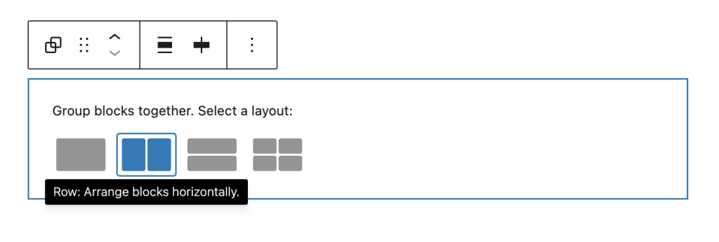
- Group Block (Row Layout) – Set horizontal layout with Wrap disabled
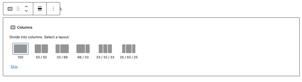
- Columns Block – Any columns layout (stacking enabled by default)
Enable Vertical Stacking
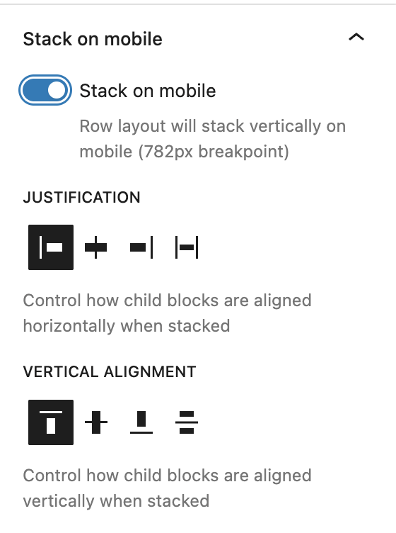
For Group blocks: Toggle “Stack on mobile” to enable vertical stacking on mobile devices.
For Columns blocks: Stacking is enabled by default – just configure alignment settings.
Advanced Settings
Justification Control
Control how child blocks are aligned horizontally when stacked on mobile:
- Start – Align to left (default)
- Center – Align to center
- End – Align to right
- Stretch – Stretch to fill container width
Vertical Alignment Control
Control how child blocks are aligned vertically when stacked on mobile:
- Top – Align to top (default)
- Center – Align to center vertically
- Bottom – Align to bottom
- Space Between – Distribute space evenly between items
Understanding Vertical Alignment
This controls vertical positioning within the container. Use “Space Between” to add spacing between stacked items or “Center” to center them vertically in the viewport.
Mobile Breakpoint
The extension uses WordPress’s standard responsive breakpoint:
- Mobile – Screens 781px or less (stacking applies)
- Desktop – Screens 782px or more (row layout preserved)
Examples
E-commerce Product Cards
1. Add Group block → Set layout to Row with "No wrap" 2. Add 3 Product Card blocks side by side
3. Enable Mobile Stack
4. Set Justification to "Center" for centered cards on mobile
5. Set Vertical Alignment to "Space Between" for even spacing
6. Result: 3-column row on desktop, stacked cards on mobile
Team Member Profiles
1. Add Columns block (2 columns)
2. Insert team member profile in each column
3. Keep default stacking (enabled for Columns)
4. Set Justification to "Stretch" for full-width profiles on mobile
5. Result: Side-by-side on desktop, stacked full-width on mobile
Feature Cards with Images
1. Add Group block → Row layout with "No wrap"
2. Add 4 Feature Card blocks (icon + text)
3. Enable Mobile Stack
4. Set Justification to "Start" for left alignment
5. Set Vertical Alignment to "Top"
6. Result: 4-column feature row on desktop, vertical stack on mobile
Tips & Best Practices
- Content Width – Child blocks automatically stretch to 100% width on mobile
- Alignment Choice – Use “Center” justification for centered content like cards or images
- Vertical Spacing – Use “Space Between” to evenly distribute stacked items vertically
- Mutual Exclusion – Mobile Stack automatically disables X-Axis Scroll (they can’t work together)
- Preview Responsively – Use browser responsive mode at 781px to see stacking behavior
Key Points to Remember
- Group Block – Must use Row layout with “No wrap” setting
- Columns Block – Stacking enabled by default, just configure alignment
- Breakpoint – 782px (matches WordPress admin bar breakpoint)
- Child Width – All children stretch to 100% width when stacked
Quick Troubleshooting
Can’t see Mobile Stack Settings?
→ For Group blocks: Check that layout is set to “Row” with “No wrap”
→ Make sure the block is selected and sidebar is open
→ For Columns: Settings always visible (stacking is default)
Stacking not working on mobile?
→ Check your screen size – breakpoint is 782px
→ Preview at mobile width (under 782px) to see stacking
→ For Group blocks: Ensure “Stack on mobile” toggle is ON
X-Axis Scroll disappeared?
→ This is expected behavior – Mobile Stack and X-Axis Scroll are mutually exclusive
→ Enabling one automatically disables the other
→ Choose the mobile behavior that fits your use case
Children not full width on mobile?
→ Mobile Stack automatically sets flex-basis to 100% for children
→ Check for custom CSS that might override this behavior
→ Verify child block widths are set to “default” or “fill”
Leave a Reply