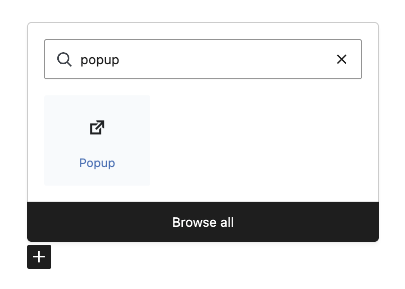
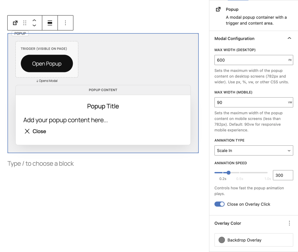
Step 1: Add the Popup Block
Search for “Popup” in the block inserter and click to add it to your page.
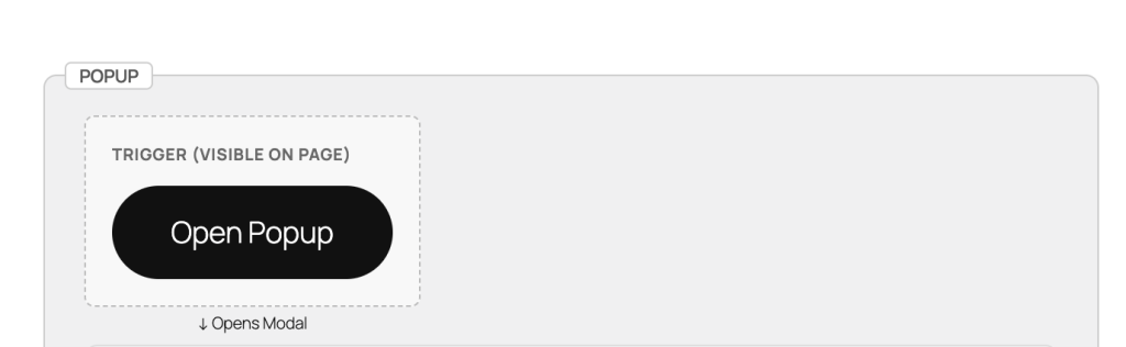
Step 2: Customize Your Trigger
The trigger is what visitors click to open the popup. You can use any WordPress blocks:
- Button (default) – Click to edit text and style
- Image – Great for promotional banners
- Text/Heading – Simple text links
- Any block – Icons, columns, groups, etc.
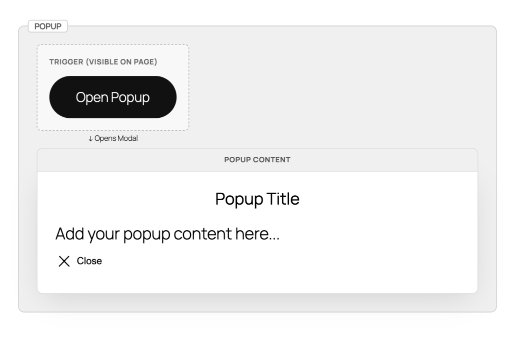
Step 3: Add Content to the Popup
Click on the Popup Content area to add any blocks you want:
- Headings and text
- Images and videos
- Contact forms
- Buttons and links
- Any WordPress block
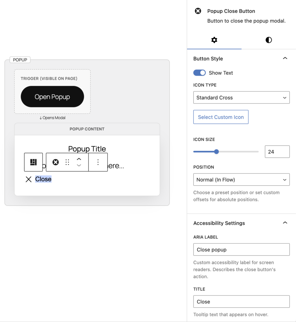
Step 4: Customize Close Button
Click on the close button to customize it in the sidebar:
- Position – Top right, top left, or custom placement
- Icon Style – Choose from X, circle-x, or upload custom icon
- Size & Colors – Adjust icon size and colors
- Button Text – Optionally show “Close” text
Step 5: Configure Popup Settings
With the main Popup block selected, adjust settings in the Inspector Controls (right sidebar):
- Width – Desktop popup width (default: 600px)
- Mobile Width – Mobile popup width (default: 90vw)
- Animation Type – Scale, fade, slide-up, or slide-down
- Animation Speed – How fast it opens (default: 0.3s)
- Overlay Color – Background color behind popup
Advanced Settings
Animation Types
Choose how your popup appears:
- Scale – Popup grows from center (default)
- Fade – Smooth fade-in effect
- Slide Up – Slides from bottom to center
- Slide Down – Slides from top to center
Responsive Width Settings
Control popup size on different devices:
- Desktop Width – Set fixed size (e.g., 600px) or percentage (e.g., 80%)
- Mobile Width – Recommended: 90vw for mobile devices
Overlay Click Behavior
Control what happens when users click outside the popup:
- Close on Overlay Click (ON) – Clicking backdrop closes popup (default)
- Close on Overlay Click (OFF) – Only close button or ESC key closes popup
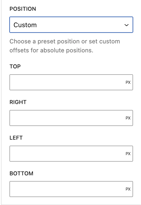
Close Button Positioning
The close button can be positioned in multiple ways:
- Absolute Positioning – Top-right, top-left, bottom-right, bottom-left
- Offset Controls – Fine-tune position with top/right/bottom/left values
- Normal (in flow) – Move the close button block anywhere within popup content using block toolbar arrows or list view
Custom Close Icons
Upload your own close button icon:
- Select the close button
- In sidebar, change Icon Type to “Custom”
- Click Select Icon to upload or choose from media library
- Adjust icon size as needed
Styling with Block Supports
All popup components support WordPress styling controls:
- Popup Content – Background, text colors, padding, border, border-radius
- Trigger – Text/background colors, padding, margin
- Close Button – Font size, colors, padding, margin, border, border-radius, shadow
Example Setups
Newsletter Signup
1. Add Popup block
2. Trigger: Button with "Subscribe to Newsletter"
3. Content: Heading + Paragraph + Form
4. Width: 500px, Animation: Scale
5. Close button: Top-right with circle-x icon
Promotional Offer
1. Add Popup block
2. Trigger: Image banner or text link
3. Content: Large heading + Discount code + CTA button
4. Width: 700px, Animation: Slide-up
5. Disable "Close on Overlay Click" for important offers
Video Player
1. Add Popup block
2. Trigger: Image thumbnail with play icon overlay
3. Content: Embed or Video block
4. Width: 90%, Mobile: 95vw
5. Animation: Fade, Close button: Minimal styling
Image Gallery Lightbox
1. Add Popup block
2. Trigger: Thumbnail image
3. Content: Full-size image + caption
4. Width: 80%, Animation: Scale
5. Close on overlay click: ON for quick browsing
Terms & Conditions
1. Add Popup block
2. Trigger: "Read Terms" text link
3. Content: Heading + long-form paragraph blocks
4. Width: 800px, Mobile: 95vw
5. Add padding to content for better readability
Accessibility Features
The popup block is built with WCAG 2.1 AA compliance:
- Keyboard Navigation – Open with Enter/Space, close with ESC key
- Focus Management – Automatic focus trap inside popup, returns focus to trigger on close
- ARIA Attributes – Proper aria-label and aria-haspopup for screen readers
- Native Dialog – Uses HTML5 <dialog> element for built-in accessibility
Tips & Best Practices
- Keep it concise – Popups work best with focused content
- Clear trigger text – Make it obvious what clicking will do
- Accessibility labels – Always provide descriptive aria-labels for triggers and close buttons
- Use overlay click wisely – Disable for critical information, enable for quick-view content
Quick Troubleshooting
Popup not opening?
→ Make sure you have both Popup Trigger and Popup Content blocks inside the main Popup block
Close button not visible?
→ Check that the close button block hasn’t been accidentally deleted – you can re-add it from the block inserter
Popup too wide on mobile?
→ Use viewport units (90vw) instead of fixed pixels for mobile width
Can’t click outside to close?
→ Check the “Close on Overlay Click” setting in the sidebar – toggle it ON
Animation looks choppy?
→ Try a faster animation speed (0.2s) or switch to “Fade” animation type
Leave a Reply